Design system
Every shared component in the shapes it actually ships in. Two colour scales, two typefaces with one job each, Tailwind utilities only — nothing in app.css beyond the tokens. Build new screens out of what is on this page, and when something genuinely new is needed, add it here first.
Colors
Two scales carry the whole app. Background is a near-neutral grey for every surface, border and piece of text; accent is a warm coffee brown for anything interactive. Both are deliberately quiet — the watercolour hero and the teacher's own headline are what should carry colour on a screen, and chrome that competes with the invitation is chrome that is wrong.
Background scale
bg-background-50 … bg-background-95050
100
200
300
400
500
600
700
800
900
950
Accent scale
bg-accent-50 … bg-accent-95050
100
200
300
400
500
600
700
800
900
950
Status colors
feedback only — never for branding, navigation or decorationRoles
bg-background-100bg-whitetext-background-800text-background-600border-background-300bg-accent-600bg-accent-50bg-background-900Typography
Two families with one job each. Playfair Display sets the invitation and every heading in the app; Source Sans 3 sets everything a teacher reads while working — labels, fields, hints, buttons. The split is the whole rule: if it is a heading it takes font-display, and if it is not, it inherits the sans and says nothing.
Display face
font-display — Playfair DisplayHero
Sommerkonzert 2026
font-display text-4xl font-bold sm:text-5xlSection
Sommerkonzert 2026
font-display text-3xl font-bold sm:text-4xlPage
Sommerkonzert 2026
font-display text-2xl font-boldCard
Sommerkonzert 2026
font-display text-lg font-semiboldBody face
inherited — Source Sans 3Lead
Everything the teacher reads while working
text-lg text-background-600Body
Everything the teacher reads while working
text-base text-background-800Small
Everything the teacher reads while working
text-sm text-background-600Caption
Everything the teacher reads while working
text-xs text-background-500Eyebrow
Everything the teacher reads while working
text-sm font-semibold tracking-widest uppercaseThe pairing
Klassenvorspiel
Sommerkonzert 2026
The display face carries the occasion and the sans carries the information. Playfair’s hairline serifs are what make a headline feel like a concert programme; at 14 px they would only make a form label harder to read, which is why nothing below a heading ever uses it.
Italics belong to both families and are used for what is genuinely emphasised, never for decoration.
Brand
one size everywhere — Brand takes no propsActions
One primary action per view — in the editor that is the export, and everything else steps back from it. Secondary carries the alternative, ghost the low-stakes action, danger anything that destroys work. ButtonLink is the same surface on a real link, so navigation stays navigation.
Variants
variant="primary | secondary | ghost | danger"Sizes
size="sm | md | lg"With icons
icon={…} leads; a trailing icon is passed as a childStates
loading takes over the icon's slot and blocks the clickNo shift while loading
the spinner replaces the icon at the same size — press it and nothing movesLinks
ButtonLink — renders a router LinkIcon buttons
label is required and becomes the accessible nameFile picker
a label around a hidden input — the browser opens the dialog, not JavaScriptSegmented
one choice out of a few, all of them visible at onceSegmented, stretched
stretch — fills its container and splits it evenly, for a control that belongs to the block under itForms
Every control is a plain presentational component with a Formik-connected wrapper beside it. The wrapper owns the label, the error and the accessible wiring, so a route only names the field. Formik counts every key of a validate result as an error, so fields with nothing wrong are dropped from the object rather than mapped to undefined. A field that may carry inline marks takes FormikRichText instead of a textarea — the same box, a Lexical editor inside it, and a plain string coming out.
Formik fields
FormikInput · FormikTextarea · FormikSelect · FormikCheckboxControl states
Any Lucide icon, passed as the icon prop.
A headline is required.
With an optional description.
Surfaces and feedback
The card is the one container. Badges label a state, alerts explain something that just happened, and an empty state stands in for a gallery or a preview with nothing in it yet. A render can fail without taking the editor down, so failures are shown next to the action that caused them and the teacher's work stays on screen.
Card
Plain card
Border, white surface, rounded-xl, p-6.
Hoverable
A card that can be clicked says so through its border on hover.
Sommerkonzert
ExportedCards compose with everything else on this page.
Badge
variant="neutral | accent | success | warning | danger"Alert
variant="info | success | warning | error"Everything stays on this device
Invitation ready
This browser is nearly full
The invitation could not be rendered
Inverted band
bg-background-900 — for a section that wants weight, never a solid accent panelReady in a couple of minutes
The band goes dark rather than solid accent, which leaves the primary button the brightest thing in it.
Empty state
No image chosen yet
Pick one of the watercolours, or upload a photograph of your own.
Spinner
sized through className, inherits the text colorMedia
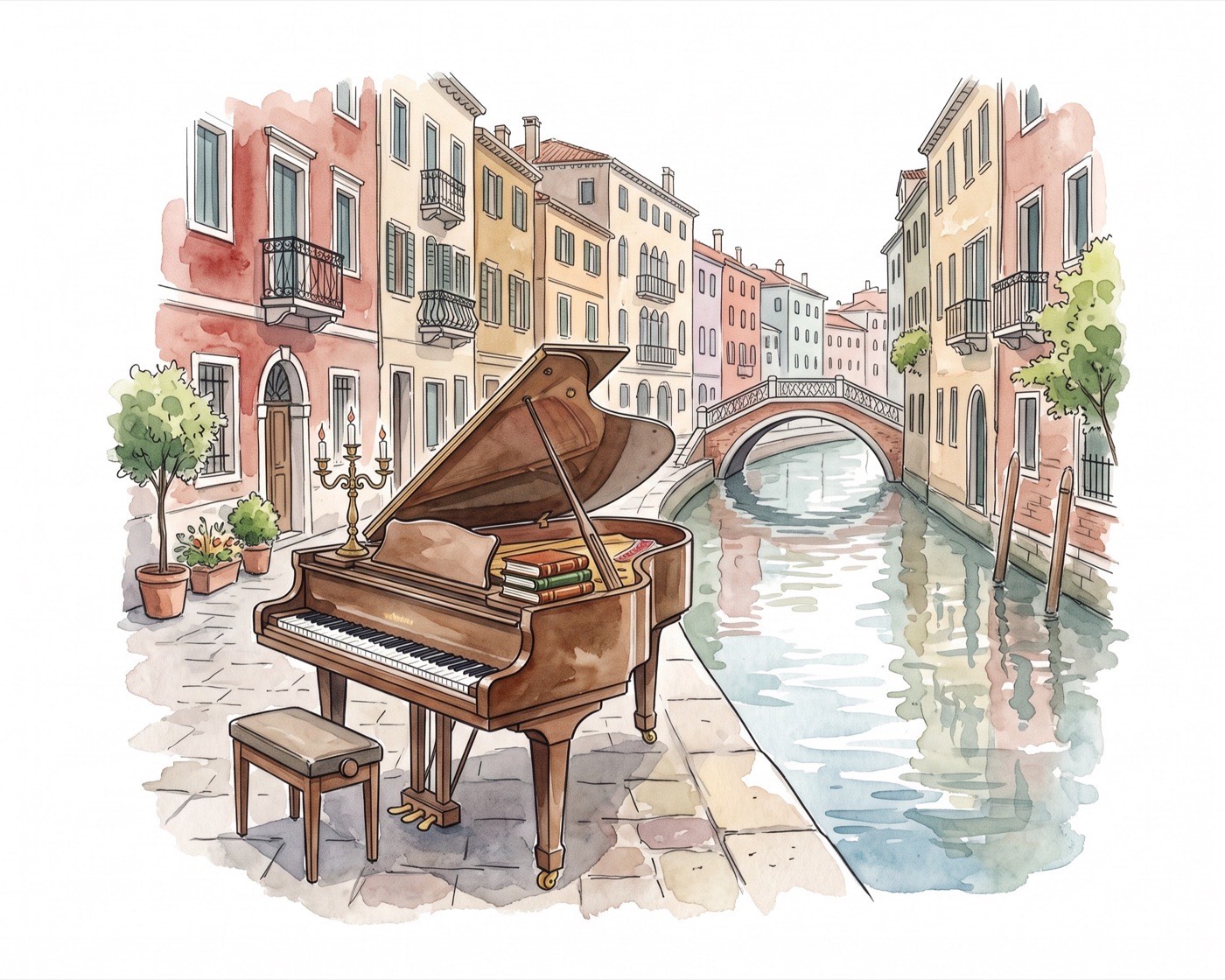
The hero image is the one shape this app is built around, and it is always 5:4 — a gallery watercolour and a photograph a teacher took on their phone end up in exactly the same box. The ratio is a theme token rather than an arbitrary class, because the frame, the browser-side crop and the print template all have to agree on one number.
Invitation preview
the print template's own HTML in an iframe — not a second rendererImage picker
one illustration at a time — the strip scrolls sideways, the page does notEmpty
aspect-[5/4] — the one ratio the whole app agrees onWith controls
children sit on top of the frame, which is how the picker attaches to it
The ratio holds
whatever column it lands in — an image is cropped to fit, never letterboxed

Icons
Lucide, imported one file at a time through SVGR. They are stroke-based and ship with stroke="currentColor", so they take the current text colour on their own — size them with size-* and colour them with text-*, and never reach for fill-* or stroke-*.
In use
import Music4Icon from 'lucide-static/icons/music-4.svg?react'music-4imageimage-plustypecalendarmap-pinticketshare-2downloadprinterSizes and colors
the Icon suffix keeps them apart from real components